If you’re anything like the typical e-commerce merchant I talk to, you’re probably obsessed with site statistics. Within the space of a few years Google analytics has turned rational thinking retailers into stats-a-holics.
I recently spent a day with a merchant who could tell me everything about his customers, where they lived, the browser and ISP they use and most importantly the paths customers take through the site. However, the one fact he couldn’t tell me was how many people visited his site from an Apple iPhone.
Come to think of it he wasn’t sure if iPhone users could even use his site. With the rapid growth of smart phones the mobile web is truly with us. So in these tips we explore just how ecommerce and mobile are converging.
STAY ON TOP Of MOBILE TRENDS.
The mobile arena is currently both the fastest changing technology sector and the fastest changing ecommerce sector. So monitor what is going on and make sure that you ecommerce site can work with both the most popular mobiles used for browsing the web, but also those that are growing fast.
CATCH ANY MOBILE PAYMENT TREND.
It looks like mobiles are becoming the new device for making payments so stay on top of this trend too.
MAKE THE RIGHT CALL FOR YOUR DEMOGRAPHICS.
Depending on who you are targeting, mobile may be more or less important. So ask the question, how many of MY customers want to buy using their mobile? Who are you trying to reach? Where and how are they visiting your web site? What does the typical visitor do at your site?
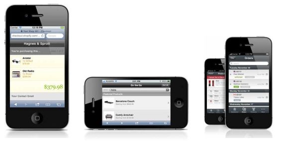
HAVE A SMARTPHONE THEME.
The fact that many smart phones can browse the main web can be misleading. Even though it’s true, most sites with their wide screens and nice pictures aren’t suitable for mobiles due to screen size and slow connections. So consider having a theme which provides a much more compact version of your store optimised for mobiles. However, remember that customers often want to see large images and have the convenience of a keyboard so actual traditional ecommerce buying is smaller on mobile than general usage might indicate.
UNDERSTAND PATTERNS OF USE.
Discovering the “where and how” of mobile use is a hard. People use mobile devices in so many different ways and in so many different places. The long standing mantra has always been to make your site usable under the worst conditions possible. Now this may not sound particularly appealing but your mobile site needs to work on both fast Wi-Fi and the slower 3G signal.
It’s the same with screen estate and input devices, catering for both large touch screens as well as smaller devices that may require a stylus or keyboard. Understanding how your customers will use your mobile site is also critical. Are they using their mobiles to purchase goods, check prices or simply looking for store information such as an address? Gaining this customer insight will define the very essence of your mobile site.
MAKE YOUR PLANS.
Mobile commerce is on a tear, and understanding who, what and how needn’t be all that difficult. My advice is simple, do your research. Think like your customers. Put together an action plan.
